DeFi · Web3 · Portfolio
SlitherGrow
Tools Used
Live Project
01
Overview
SlitherGrow is a DeFi portfolio tracker I designed and built to answer the question most dashboards ignore: what is my actual passive income this month from on-chain yield? I was the sole founder, designer, and developer.
It bridges on-chain yield with passive income by tracking staking rewards, LP positions, and liquidity across protocols, then reframes that yield into a concrete monthly spending allowance with goal milestones. Live prices, performance charts, and staking yield tracking round out the product.
02
The Problem
Most portfolio trackers show a single net-worth figure and a green-or-red delta. That number is hard to act on in DeFi. You know your balance, but not what your staking yields and LP returns are actually paying you each month, and the dashboard gives you no next step beyond watching it move.
The gap I wanted to close: turn on-chain yield and portfolio performance into something tangible, a monthly spending allowance, backed by staking and liquidity yields, with clear milestones toward a goal.
03
The Insight & My Approach
I treated this as a product problem, not just a dashboard. The key decision was to lead with the monthly allowance as the hero metric, and demote net worth to context. That single reframing changes every downstream layout choice.
Because I was solo and timeboxed, I scoped the first version to one clear loop: pull live prices, visualize performance against a goal, project a monthly allowance from staking and LP yields, and let users set a target. I deliberately cut secondary ideas (social, alerts, tax views) so the core read instantly.
04
Design Decisions & Tradeoffs
Web dashboard over mobile first. The product is data-dense (prices, P/L, yield, goals), so a wide canvas communicates more at a glance than a phone. I accepted that mobile is a follow-up, not a v1.
Real auth and a real database (better-auth + Neon) instead of a mock. It costs more to build, but it lets the product actually persist a user's portfolio and proves the full stack, not just the UI.
Guest mode with seeded demo data. The biggest risk for a portfolio piece is a blank first screen, so I seed realistic holdings and let anyone explore the product before signing up. Lowers the barrier to understanding the value immediately.
05
Performance & Goal Context
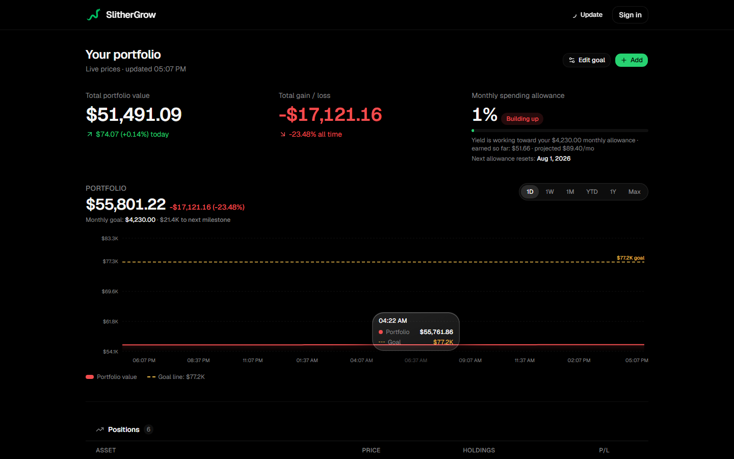
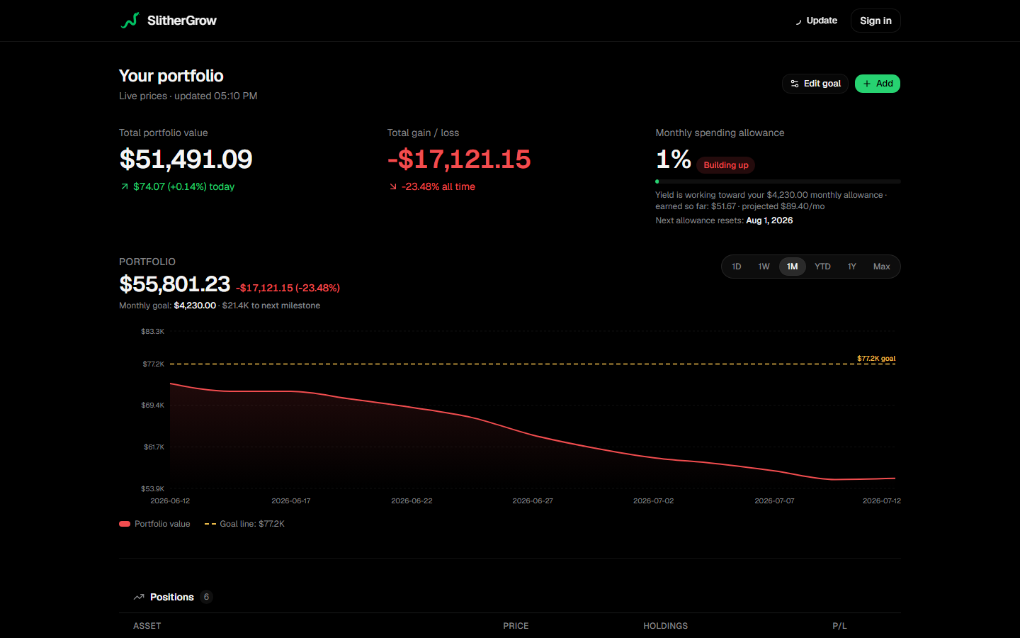
The performance chart uses Recharts with a dashed goal line, so progress toward the target is visible without reading numbers. Range tabs (1D to Max) recompute client-side for a snappy feel.
This is where the insight shows: the goal line is the product, the portfolio line is just context around it.
06
Making the Allowance Real
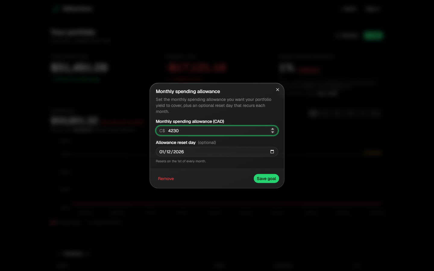
The allowance engine combines staking rewards, LP yields, and price appreciation into a projected monthly payout, then tracks distance to a user-set goal date. An editor lets users set the target and see the gap to the next milestone.
I kept the math auditable: the data model separates crypto assets, staking yields, LP positions, and settings, so every number traces back to a source.
07
Staking & Yield Integration
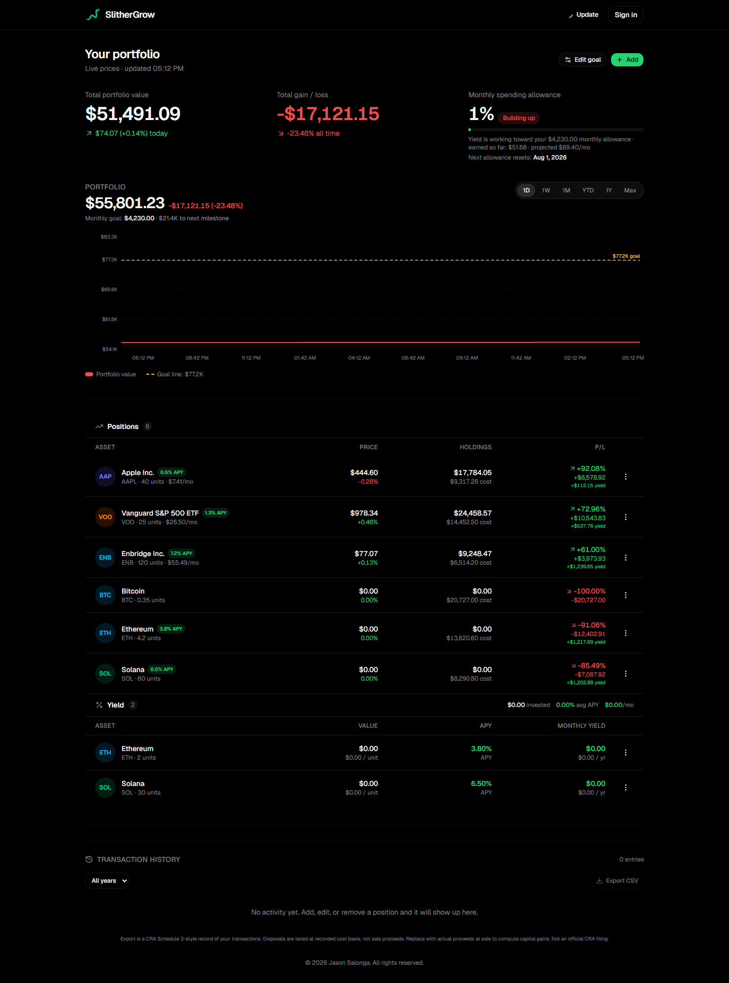
Staking positions and LP yields sit alongside spot holdings, with all yield feeding the allowance projection. Showing staking, LP, and spot together matters because the allowance is funded by both passive income and price moves.
This is where the DeFi integration shows: staking rewards and LP returns aren't just tracked for show, they directly fund the monthly allowance, making passive income visible and actionable.
08
Sign In & Guest Mode
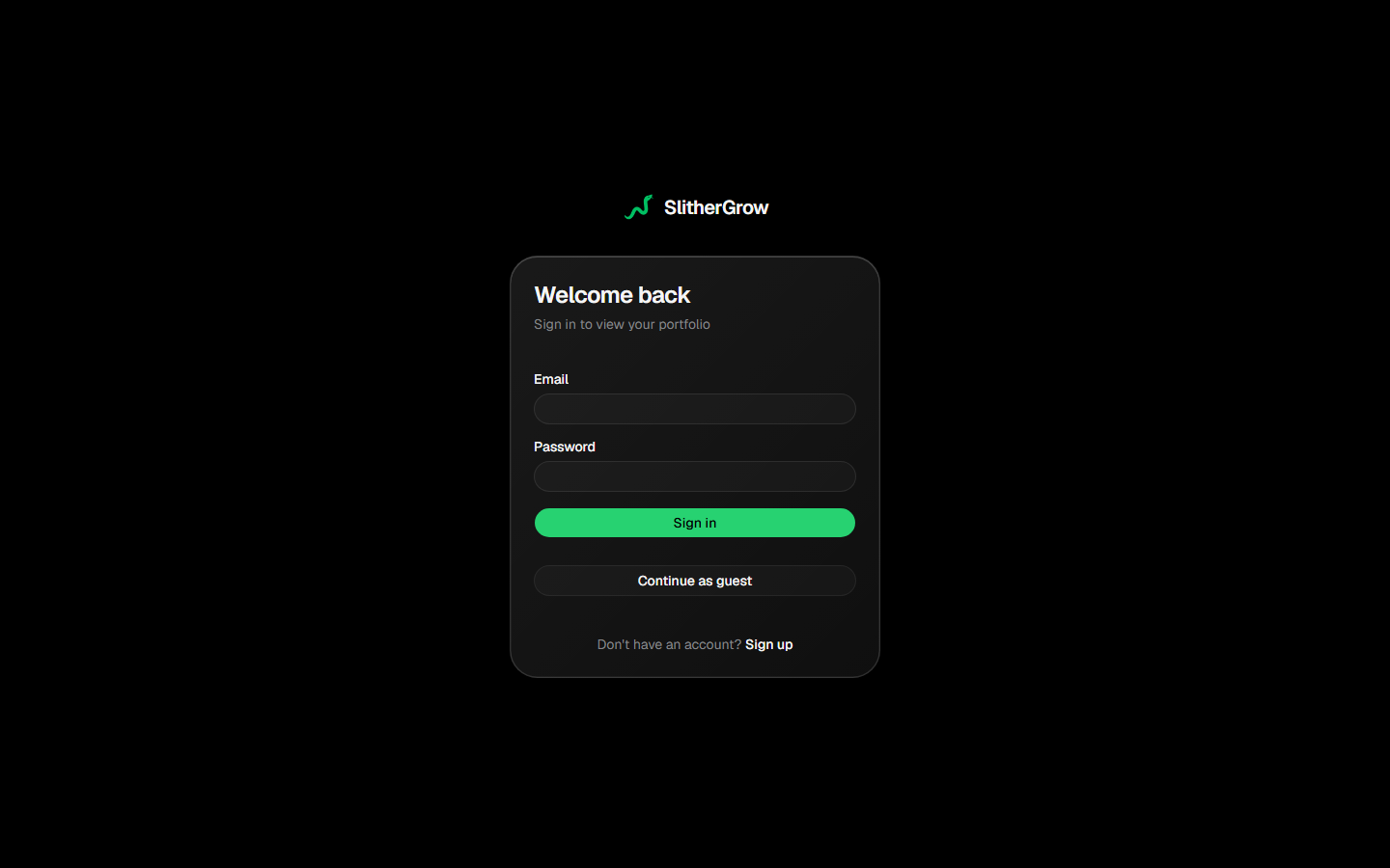
Auth runs on better-auth with a Neon-backed schema. New visitors continue as a guest to explore the seeded demo, then sign in to persist their own portfolio. The split keeps the first run frictionless while still demonstrating a real authenticated product.
09
What I Learned & What's Next
The two total-value figures, portfolio alone versus portfolio including the allowance, needed clearer separation. If I rebuilt it, I would show one primary figure with the allowance as a derived callout, removing the ambiguity.
The product is a complete solo build and demonstrable today. The next step is putting it in front of a few users to confirm the allowance framing actually changes how they think about their holdings, turning design intent into measured behavior.
Impact
Built a DeFi-native portfolio tracker that bridges on-chain yield with passive income, tracking staking, LP positions, and liquidity across protocols.
Reframed the core metric from net worth to a livable monthly allowance, making portfolio performance personally actionable.
Shipped a full product solo: live-price ingestion, a Recharts performance view with goal lines, staking yield tracking, and a guest mode with seeded demo data.
Made deliberate, documented tradeoffs (web over mobile, real auth over mock, resilient demo data) and can speak to each one.
Key Features
DeFi yield bridging
Bridges on-chain staking and LP yields with passive income, turning DeFi returns into a concrete monthly allowance.
Live prices
Real-time quotes ingested per request, with static fallbacks so the demo never breaks.
Performance chart
Recharts line view with a goal line and 1D to Max ranges.
Goal milestones
Set a target date and track distance to the next milestone.
Staking & LP tracking
Staking rewards and LP positions feed the allowance projection alongside spot holdings.
Web3-native
Built for DeFi users who farm yield across protocols, with on-chain yield as the core metric.
Guest mode
Seeded demo data so the product is explorable before sign-up.