UI / UX Design
BC Agri Weather Program
Tools Used
01
Overview
The BC Agri Weather Program runs a network of over 500 stations across the province, reporting temperature, rain, humidity, wind, and soil conditions in real time. I led the UX and visual redesign.
The goal was simple: turn that raw sensor stream into something a farmer can act on in seconds. The original site dumped numbers into tables. I rebuilt it around how growers actually make decisions.
02
Understanding the Farmer's Need
I started with the audience. Farmers check weather for irrigation, frost protection, spray windows, and harvest timing. The old site had one map and dense tables, with no way to narrow down.
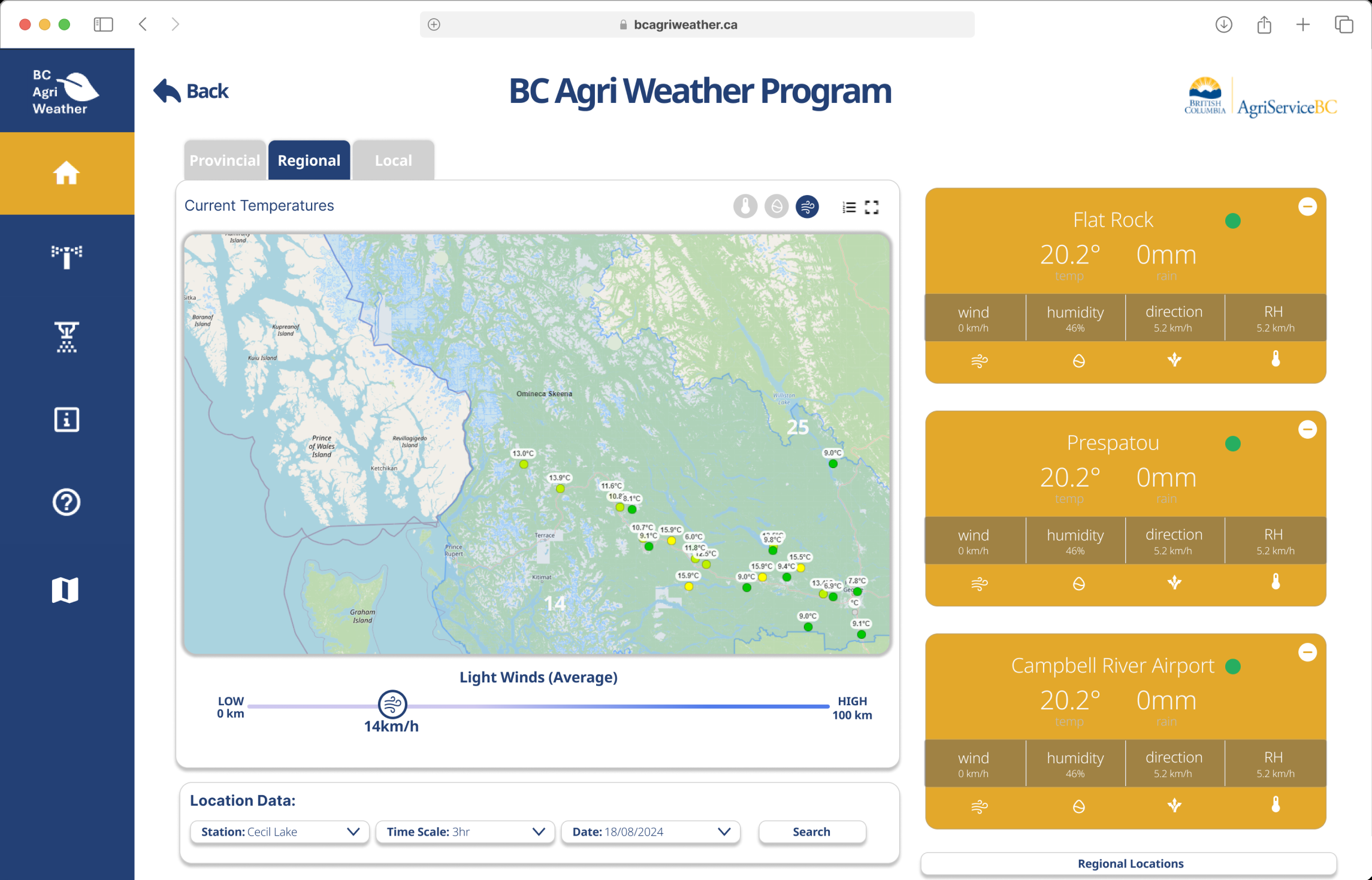
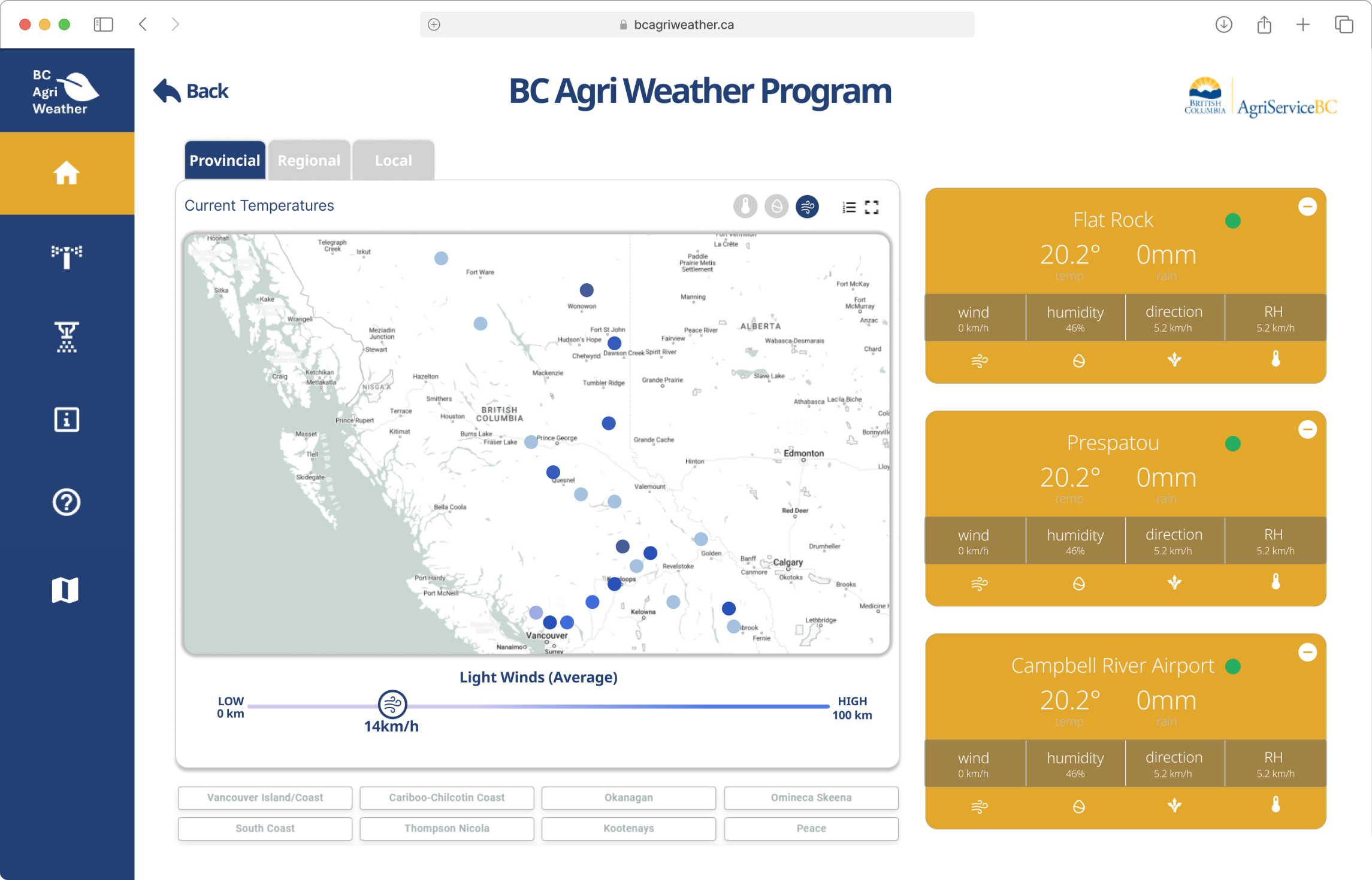
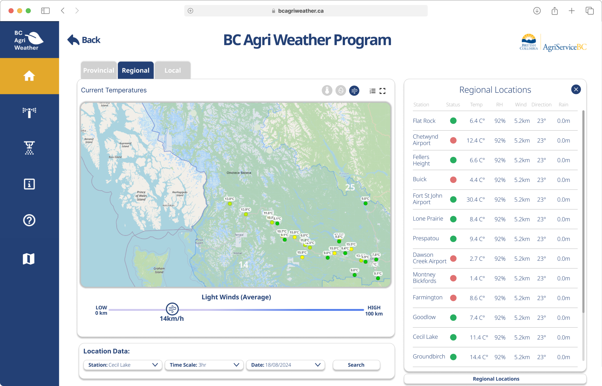
A farmer checking spray conditions doesn't want province-wide wind speeds, they want their local station's reading right now. That need shaped a three-tier structure: Provincial for the overview, Regional to filter by zone, and Local for one station in depth.
03
Designing the Drill-Down
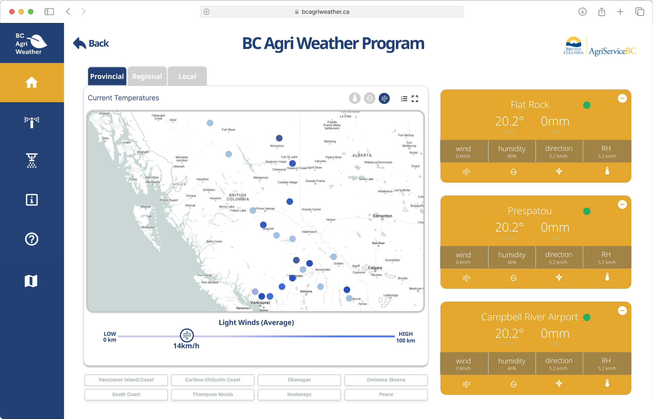
Navigation follows a simple zoom-in pattern. The Provincial tab maps every station as a color-coded pin, green for active, yellow for caution. Regional buttons jump straight to a zone.
The Local tab is the payoff: a single station's full profile with current conditions, daily extremes, and a 24-hour graph. I used a two-line chart, temperature in blue, humidity in red, because their inverse relationship is exactly what growers watch for drying and frost risk.
04
Making Data Glanceable
The weather cards were the hardest interaction to get right. Six metrics on one card can turn into noise fast, so I ranked them: temperature biggest, precipitation and wind in the middle, humidity and direction secondary. A green dot signals a live station without reading a word.
Above the map, toggleable layers switch the pins between temperature, precipitation, and wind, and a wind slider filters stations by condition, which matters for timing a spray window.
05
Validating with Agronomists
I prototyped the three-tier flow in Figma and walked agronomists through it. The first version used a single map with a buried dropdown, and users kept missing their regional stations. The three-tab layout with direct regional buttons cut the path from landing to local data from four clicks to two.
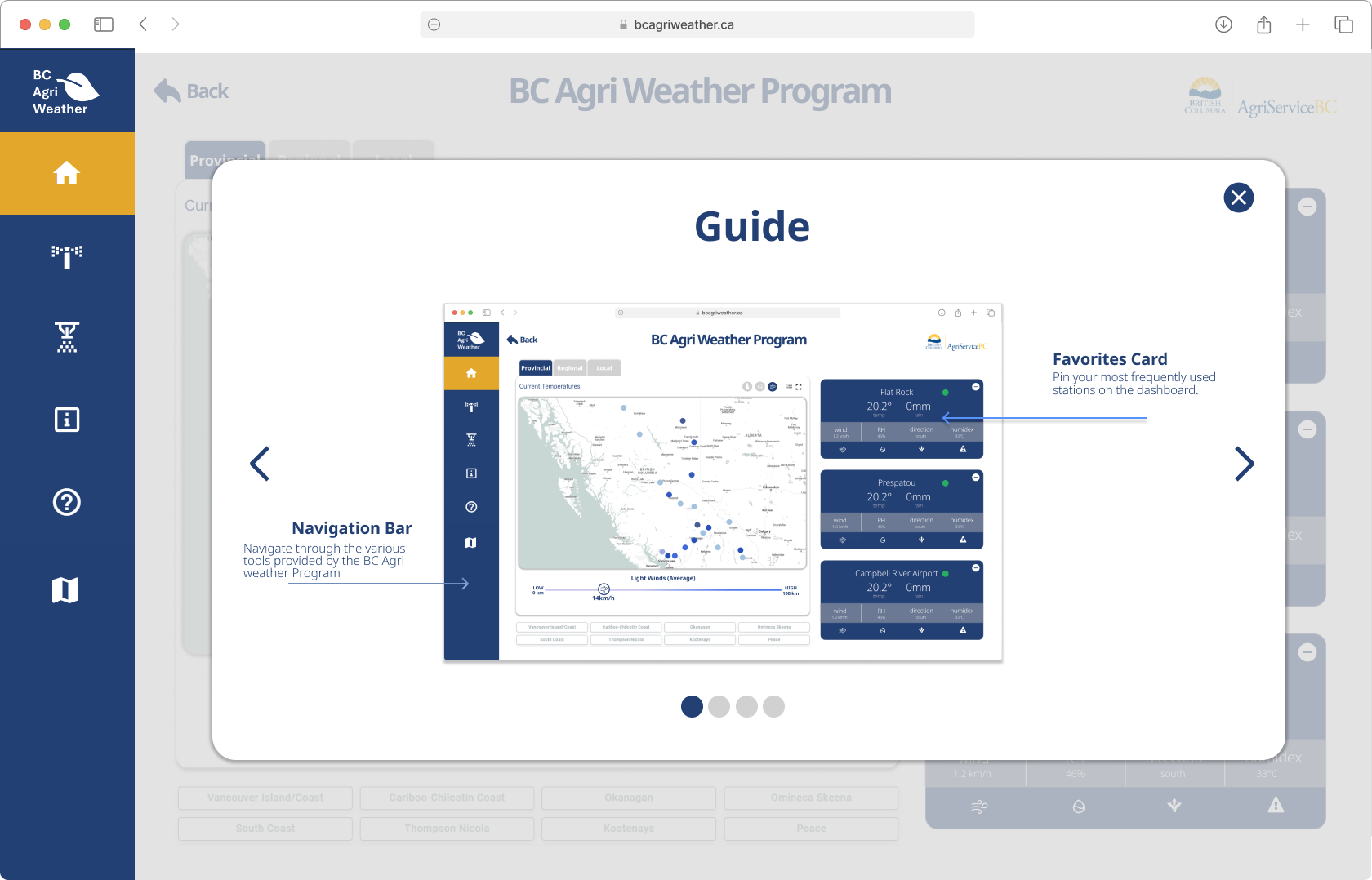
I also added a first-visit onboarding guide covering the nav bar, favorite stations, data layers, and regional filters, since the original site offered no entry point for new users.
06
What I Learned
The core lesson: government data doesn't have to look like a spreadsheet. The data was already there, over 500 stations reporting multiple metrics, but the old design assumed people would read every number.
By organizing the same data into tiers and prioritizing what matters at each level, the interface shifts from 'here is everything' to 'here is what you need.' If I took it further, I would test the drill-down with first-time users against real field decisions.
Impact
Designed a three-tier information system (Provincial to Regional to Local) that lets farmers zoom from a province-wide map to a single station in two clicks.
Built a visual weather data system, color-coded station pins, real-time cards, and historical trend graphs, replacing tabular data dumps with glanceable insights.