Intrigue
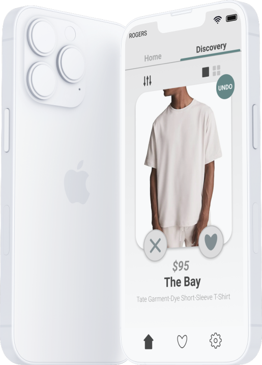
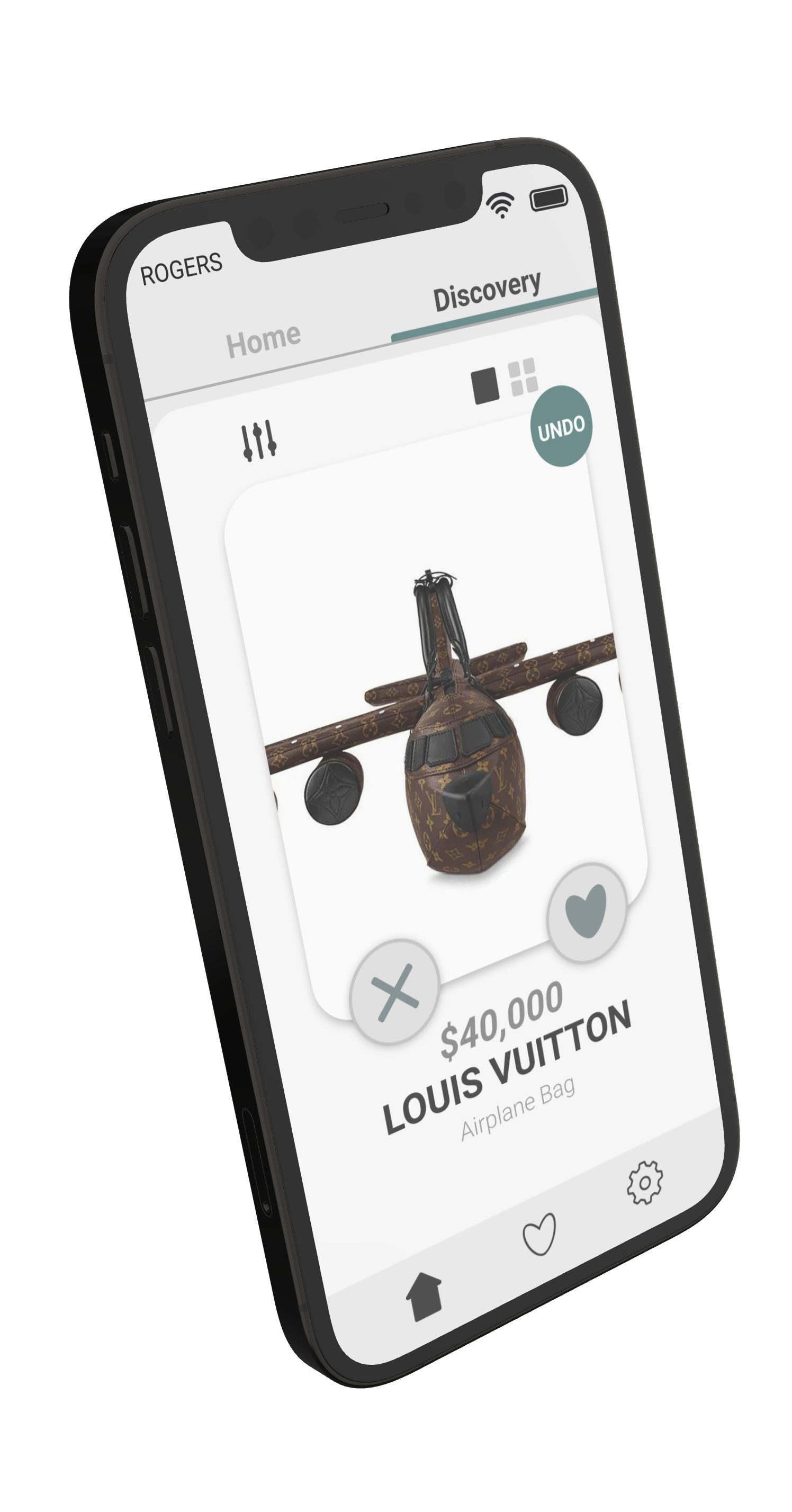
Intrigue is a concept made for a mobile clothing application which would allow users to spend less time on finding clothes that they find appealing based on the most popular fashion trends.

Intrigue is a concept made for a mobile clothing application which would allow users to spend less time on finding clothes that they find appealing based on the most popular fashion trends.
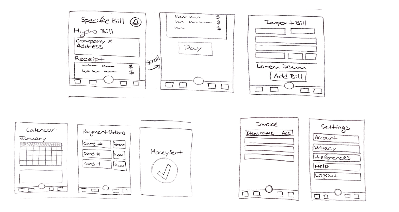
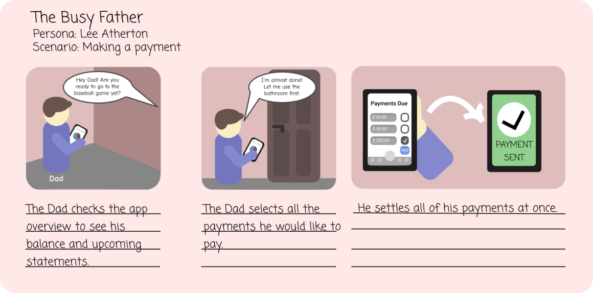
The concept of intrigue didn't start off as a clothing app. It started off as a financial bill management application to help users pay various bills from a single location which would also let users manually add statements and send alerts of upcoming bills.
I was able to create the initial design concepts for my app. I started off by creating wireframes that showed the basic structure and layout of the app. I then worked on refining the wireframes into polished, high-fidelity designs that accurately represented my vision for the app. Figma allowed me to experiment with the design and interface elements until I arrived at a design that I was happy with.
Initially, I thought to make a billing app that would help small businesses manage their finances more easily. However, as I continued to work on the project, I began to realize that there were already similar apps on the market, and that the idea was not original enough to compete with other existing applications on the market.
I decided to pivot my concept and focus on clothing. I then realized that there was a significant need for a user-friendly, time-saving app that could help people find new clothing trends and browse for styles more efficiently.
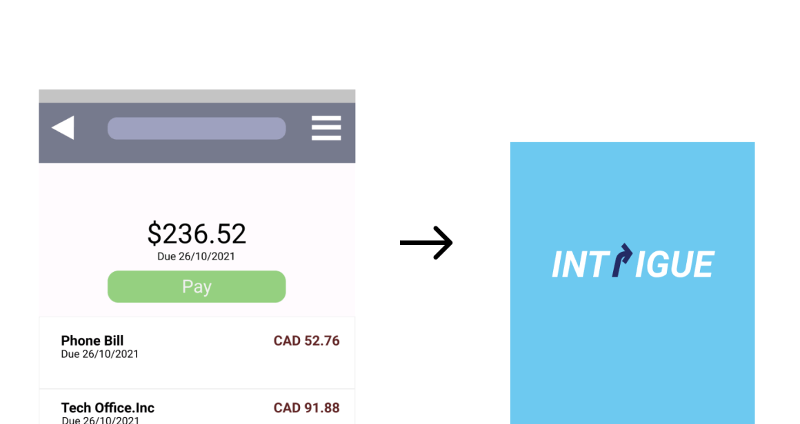
I was still able to focus on the goal of helping users save time on daily activities. I began to research clothing trends and design, and worked on building a user-friendly interface that would allow users to easily input their favorite clothing styles to browse more efficiently for clothing pieces.

Once I had an initial design concept made, I used Protopie to create the app's interface which allowed me to create interactive functionalities that would accurately represent the app's intention. I was able to see how the different screens and elements of the app would work together.

The color scheme of the application focuses on keeping a minimalistic and sleek themed interface that gives the users an easy way to navigate through various clothing collections easily without any hassle.
By using Figma and Protopie together, I was able to create a polished and functional design for my app that accurately represented my vision. The combination of Figma's and Protopie's prototyping capabilities allowed me to create a user-friendly and intuitive interface that would keep users engaged.
Developing Intrigue has allowed myself to explore new techniques that would help me approach design in a more creative and original way. It has taught me the importance behind understanding the methods of prototyping and evaluating user data in a systematic structure.
Intrigue combines various brands into a single application that offer users a way to discover clothing styles which are currently in fashion. Users will be able to add items into their favorites list which would redirect them to the official web page of the product.
